
Draft
Product Development

How do you fix what you can't measure?

No map. So we found the route.

A global semiconductor and AI computing company ran hundreds of products across eight divisions with no shared view of how any of them were performing. The answers lived in scattered systems, spreadsheets, and people's heads. An internal team had chased the fix for eighteen months but to no avail. In twelve weeks, we put it in their hands.

82M
Data points ingested
and normalized
12 wks
Kickoff to working
platform on live data
370
Products mapped
across 8 divisions
1
Stage 01

The Challenge

370 products. Nine systems holding fragments of the evidence. Zero measures of whether any of it was actually working for the developers it was built for.

A product leader inside one of the world's largest semiconductor and AI computing companies had been making the same case for years: developer-facing documentation across the portfolio was failing the developers who depend on it. They had no evidence to prove it. Too small for the seven-figure consultancies, too low-priority for internal shared services, the work was attempted in the margins for more than eighteen months: never staffed, never finished, never killed.

The deeper problem was cultural. Speed was the point: idea on Monday, release on Friday, often with no PRD, no personas, no jobs-to-be-done. But products that ship half-baked get relaunched, and launching three times is not fast. Debt piled up behind every release: deprecated platforms, stale docs, developers left holding the bag. Teams knew they were getting dinged for it. Nothing forced it to surface.

And the asset at risk is the company's most valuable one: the reputation of its platform among developers. You cannot fix what you cannot measure.

Two kinds of debt were compounding against it. Product debt: the readiness work promised every release and delivered in almost none. Organizational debt: what teams knew about product health, trapped in nine disconnected systems and in people's heads. Neither is a technology problem, and neither surfaces on its own.

2
Stage 02

The Team

A small senior team spanning product strategy, architecture, data engineering, and design, working alongside the client's champion and, on site, with the TPMs and content owners who would live inside the tool. The build ran as an AI software factory: an agent swarm on a managed backlog, senior engineers owning architecture, review, and the definition of done.

3
Stage 03

The Approach

The engagement started as an accountability tool for bad documentation. It ended as an enablement platform for product readiness: a reframing that turned an unachievable internal request into something nine product teams asked to join immediately. From prototype to a production tool analyzing 82M data points in only three months.

3.1

Reframe the problem

Bad docs were the visible symptom of something upstream. We kept documentation as the entry point, since it is measurable and the pain is undeniable, while pointing the platform at the cause: releases shipping without the product fundamentals in place. That shift gave the initiative a business case instead of a complaint.

3.2

Prototype in the room

On day one of the onsite, the client put their head down for ninety seconds, looked up, and said the whole thing had to change. The Release Readiness dashboard was prototyped that week, in the room, and demoed to TPMs and content owners before anyone had time to write a requirements doc.

3.3

Build the measure that didn't exist

Sense, make sense, act. Nine sources normalized through a single API into 82M data points, then graded by a net-new, deliberately conservative model: LLMs at the edges where judgment is required, deterministic logic in the middle where it isn't, and a coverage-aware rollup so no product is graded as though missing data were good data. Six dimensions per product, one portfolio health score, page-level insight for the authors who have to fix it.

3.4

Run our own factory in the open

We built this with an agent swarm and felt the failure modes firsthand: agents with thin context on product intent and architecture produce work that looks production-mature long before the foundation is. A printing press guarantees volume, and volume alone. That is exactly what the platform now measures for: quality that scales at the same rate as speed.

4 Stage 04

The Platform

Twelve weeks earlier this was a whiteboard. Now it is working software in a secured private cloud, running against live portfolio data. Three surfaces sit on one ingestion layer: a documentation insights dashboard scoring every product on six dimensions; a release readiness dashboard that makes the product fundamentals (PRD, personas, jobs-to-be-done, security, accessibility, GTM) visible in real time as a launch date approaches; and an internal signal harvester that maps the portfolio and monitors the pipeline itself. It shows raw data, synthesized analysis, and, deliberately, the data that is missing.

Platform GalleryPipeline · ingesting
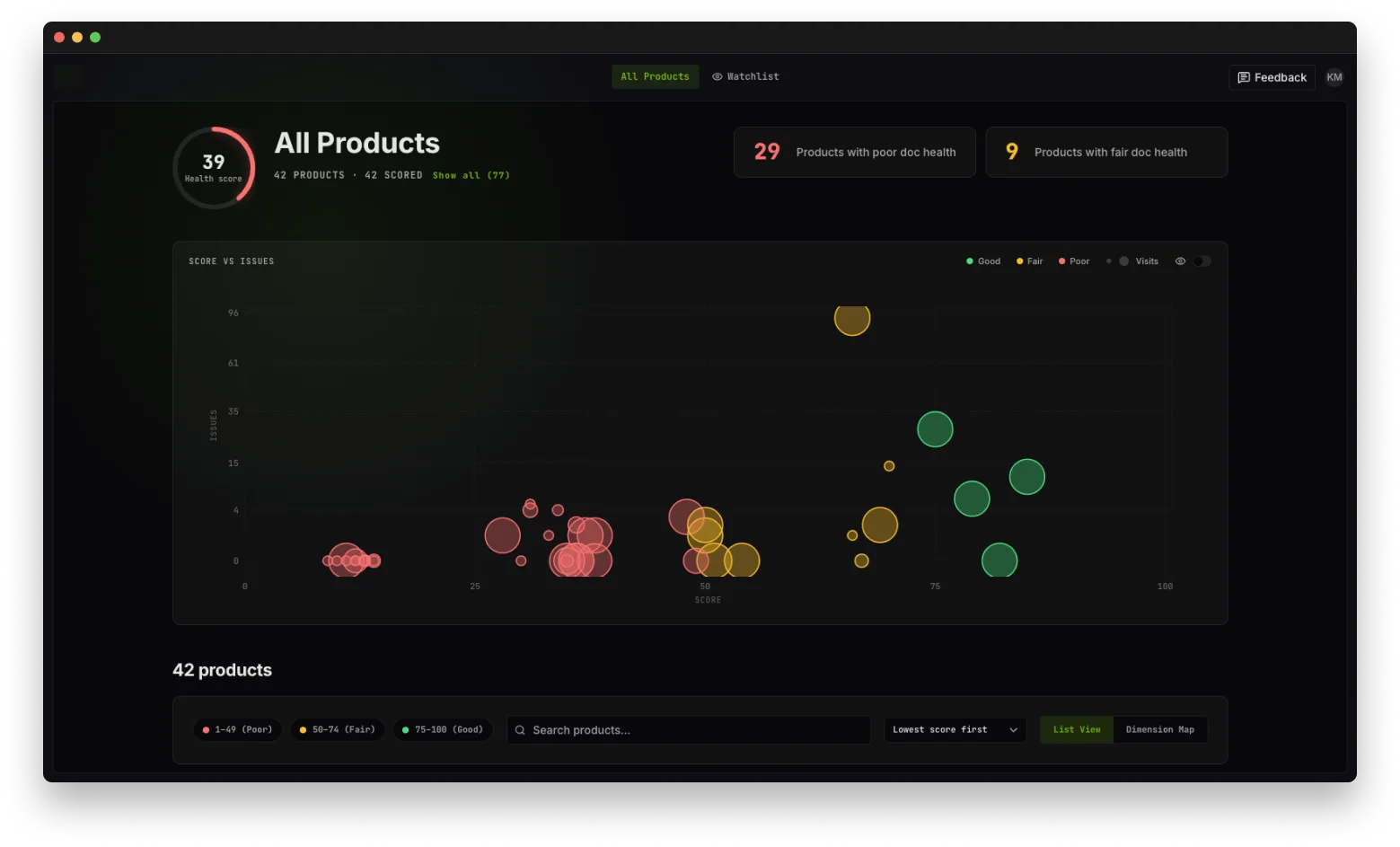
01 Portfolio Health
Portfolio health dashboard: score versus issues across every scored product, with poor and fair doc health counts
Every product scored on one scale, plotted against open issues and traffic. The first time anyone could see the shape of the problem in a single view, and the first time a low score became visible to the team that owns it.
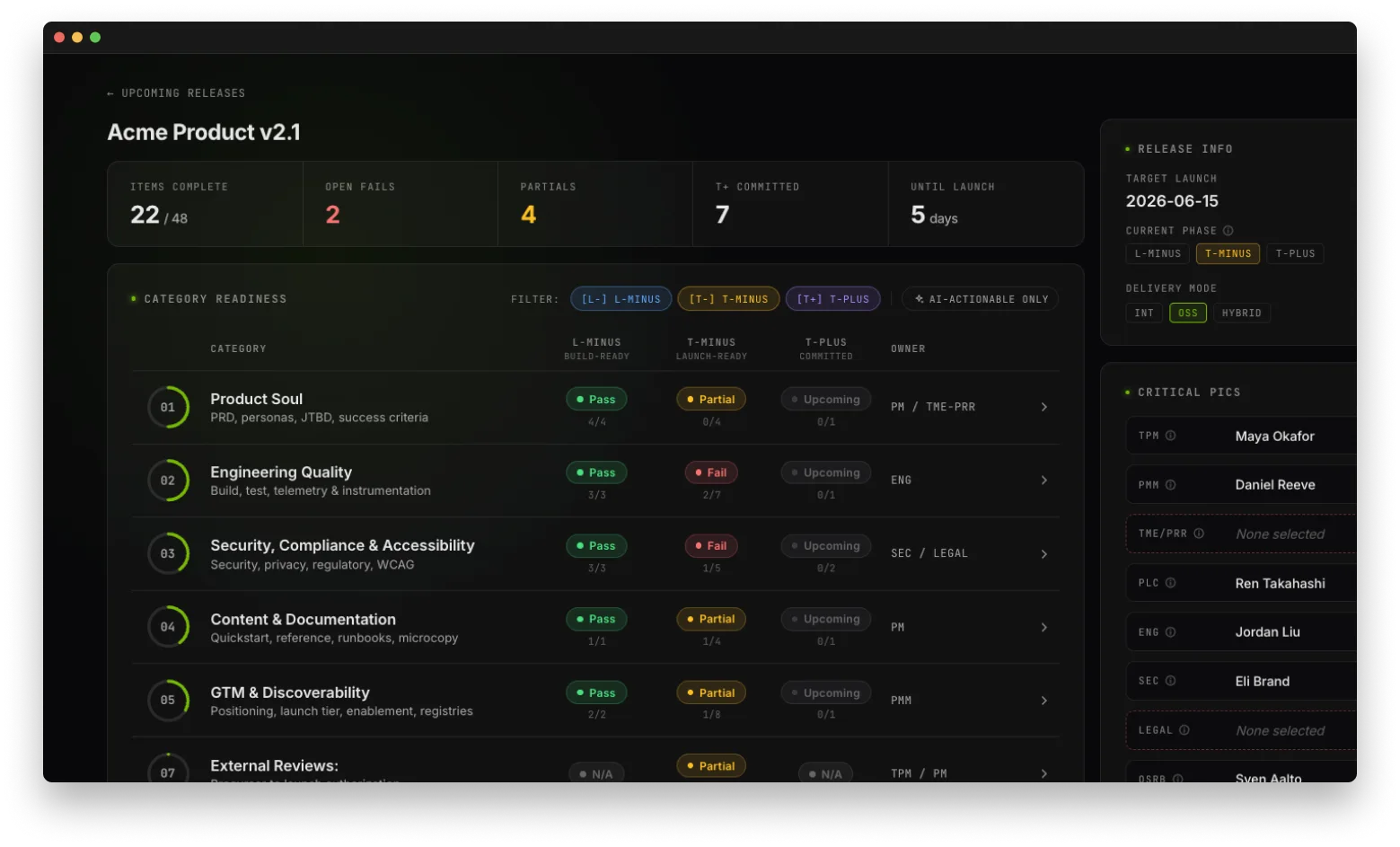
02 Release Readiness
Release readiness dashboard: category readiness across build-ready, launch-ready and committed phases with named owners
Product fundamentals as a live checklist while there is still time to act. Product soul, engineering quality, security and accessibility, content, GTM: each pass, partial, or fail, phased against the launch date and attached to a named owner. Prototyped on site in week one.
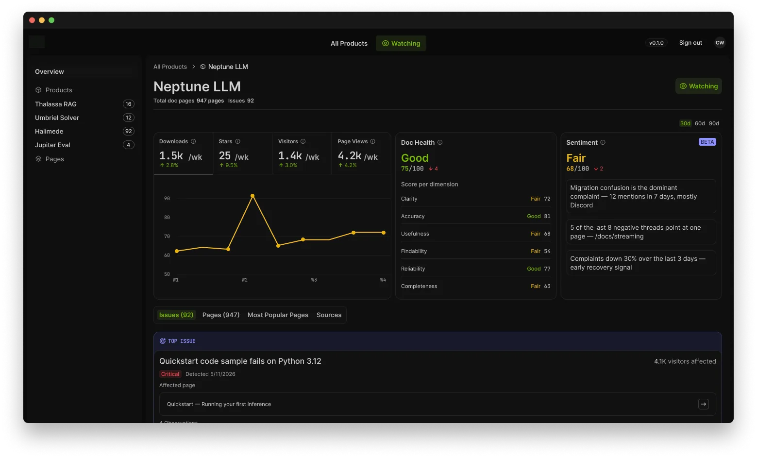
03 Product Detail
Product detail view: traffic metrics, doc health by dimension, sentiment analysis and ranked issues
One product, six graded dimensions, sentiment pulled from community channels, and issues ranked by visitors affected, down to the single page driving most of the complaints.
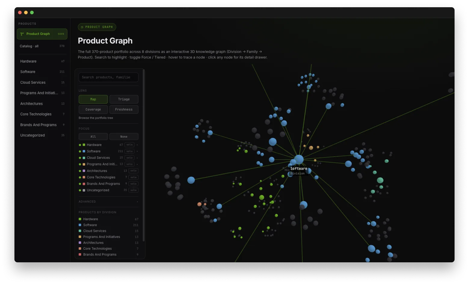
04 Portfolio Graph
Interactive portfolio graph: 370 products across 8 divisions as a division, family and product knowledge graph
370 products across 8 divisions as a navigable knowledge graph: coverage, freshness, and triage as lenses over the same map. The portfolio, finally connected.
5 Stage 05

The Results

Eighteen months of internal effort had produced no platform. Twelve weeks after kickoff, one was running on live portfolio data, and it covered more ground than the brief asked for. The scope was a documentation scorecard; we delivered that, plus the release readiness dashboard and the portfolio graph underneath it. Demand showed up immediately: nine products asked to be added, teams began requesting API access to the data layer, and the standing request became more access, more data, more coverage.

The scoring model turned an unmeasured asset into a number leaders can act on, and made low scores visible enough to create productive internal competition. Documentation health was the wedge; product readiness is the franchise.

36 hrs
To onboard a product,
request to live scores
9
Products requesting
onboarding, unprompted
6
Graded dimensions,
net-new scoring model
3
Shipped surfaces on
one ingestion layer

Because the data model and ingestion layer were built to outlast the first three dashboards, every new product and every surface built on top of it inherits the same definition of good on day one.

“We had been arguing about this for two years without a single number to point at. Twelve weeks later our leadership was making better decisions about the entire portfolio.”

Product leader · Client team

The business hasn’t changed. What’s possible has.

Let’s build what’s next.

Start a conversation →